Every photographer knows the frustrating paradox of a technically flawless image that nevertheless falls entirely flat. The focus is pinpoint sharp, the histogram indicates a balanced exposure, and the rule of thirds was executed with precision. Yet, when opened on the editing monitor, the photograph lacks soul. It feels hollow, unfinished, and uninspired.
According to industry professionals, the chasm separating a merely competent snapshot from a breathtaking, emotionally resonant work of art rarely stems from drastic overhauls or complex composite work. Instead, it is bridged by subtle, highly intentional finishing touches.
In the modern digital darkroom, photographers have an array of software options at their disposal, but few tools address this exact emotional deficit as effectively as the often-overlooked Color Harmony feature found within Skylum’s Luminar Neo. Tucked away neatly in the Professional Tools section, this robust yet accessible utility has quickly transitioned from a hidden gem to an indispensable asset for creators looking to refine tone, contrast, and color balance without resorting to heavy-handed processing.
Main Facts: Unlocking the Power of Color Harmony
The fundamental premise of Color Harmony in Luminar Neo is not to execute radical, artificial transformations, but rather to introduce nuanced, granular control over how distinct color families interact across the canvas of an image.
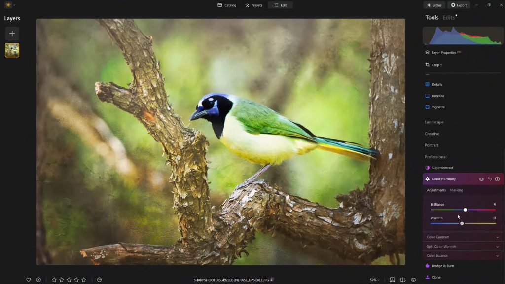
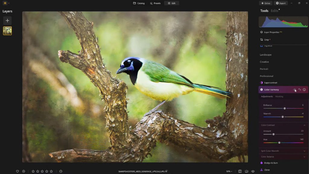
Rather than relying on blunt instruments, the tool is segmented into targeted adjustments: Brilliance, Warmth, Color Contrast, Split Warmth, and Color Balance. Each individual control is engineered to work in concert with the others—guiding the viewer’s eye organically, establishing a clear visual hierarchy that emphasizes the primary subject, and forging a cohesive aesthetic that aligns with the natural mood and lighting conditions of the scene.
For photographers striving to avoid the dreaded "over-processed" look, Color Harmony provides a sophisticated middle ground, offering professional-grade color grading capabilities within a streamlined user interface.
Chronology and Evolution: The Shift Toward Intelligent Editing
The evolution of digital photo editing over the past two decades has followed a distinct trajectory. In the early days of digital sensors, the primary battle was fought over basic technical recovery—rescuing blown highlights, lifting deep shadows, and reducing digital noise. Once RAW processing engines matured, the industry shifted toward global adjustments and heavy localized masking.
However, as algorithms and AI-driven editing platforms gained prominence in the late 2010s and early 2020s, developers recognized a new bottleneck: photographers were spending countless hours manually balancing tones across complex scenes. Skylum introduced Luminar Neo to address this exact workflow inefficiency.
While AI tools like Sky Replacement and Generative Erasure captured mainstream headlines, underlying professional modules like Color Harmony received continuous, iterative refinements. By centralizing advanced color theory concepts—such as complementary color tension and split-toning—into intuitive sliders, the software democratized cinematic color grading. Today, features like Color Harmony represent the modern standard of editing: maximizing artistic impact while minimizing tedious, manual masking.
Supporting Data and Technical Breakdown: Mastering the Sliders
To fully leverage the capabilities of Color Harmony, photographers must understand the specific function and mechanical impact of each component within the toolset.
1. Brilliance and Warmth: The Gentle Touch
Standard saturation tools amplify all colors indiscriminately, frequently clipping bright channels and resulting in neon, unnatural tones. Brilliance, by contrast, operates with surgical restraint.
Brilliance: Incremental adjustments increase or decrease vibrance intelligently. A slight positive boost enriches colors while strictly preserving underlying natural textures and details.
Warmth: This slider acts as an emotional thermostat for the frame. Shifting right introduces an inviting golden hour ambiance, while moving left instills a crisp, cooler atmosphere. The golden rule of professional editing is emotional alignment: the warmth must mirror the psychological tone of the capture environment.
2. Color Contrast and Split Warmth
Visual tension is a core pillar of compelling composition. Color Contrast deliberately increases the dynamic tension between opposing color ranges—most notably the interplay between warm highlights and cool shadows. When applied judiciously, it creates striking three-dimensional depth, making subjects pop from their backgrounds without requiring heavy local dodging and burning.
Split Warmth takes this a step further by granting isolated control over warm and cool tones within specific luminance ranges. This is particularly vital in complex mixed-lighting environments, such as forest interiors dappled with sunlight or urban street scenes at twilight.
3. Color Balance: Precision Grading
For advanced users, Color Balance offers independent manipulation of shadows, midtones, and highlights. By nudging the midtones toward specific hues, creators can establish a uniform color signature across an entire portfolio. This level of targeted control is what elevates amateur vacation snaps to the visual standards of high-end editorial and commercial campaigns.
Official Insights: A Philosophy of Restraint
Vanelli, Director of Education at Skylum, an accomplished photographer, author, and former Triple Crown Karate champion, emphasizes that the hallmark of exceptional editing is restraint.
"What sets apart a truly compelling image often isn’t a dramatic change—it’s a handful of carefully considered enhancements," Vanelli explains. "Color Harmony, combined with subtle vignetting and a thoughtful editing approach, adds depth, emotion, and cohesion."
Vanelli’s pedagogical approach—frequently showcased through his instructional webinars, conference keynotes, and the popular Luminar Coffee Break series—focuses heavily on teaching photographers how to step back from their work. He routinely advocates for saving custom editing lookups as presets, not just for workflow efficiency, but as a critical self-critique mechanism.
"After a break, it’s common to see areas where the edit may have gone too far," Vanelli notes. "Using a saved preset, the effect can be reapplied at a reduced strength—such as 70 to 80 percent—maintaining the core aesthetic while easing any over-editing."
Implications for the Creative Community
The widespread adoption of intelligent color grading tools like Luminar Neo carries profound implications for both amateur and professional photography markets.
First, it democratizes high-end post-production techniques. Historically, complex color grading required a deep working knowledge of color wheels, curve manipulations, and intricate masking layers typically mastered by high-end retouchers. By abstracting these concepts into intuitive sliders, tools like Color Harmony empower landscape, wildlife, and portrait photographers to achieve cinematic results in a fraction of the time.
Second, it redefines workflow efficiency. In a commercial landscape where content velocity is paramount, photographers are under immense pressure to deliver galleries faster than ever before. Streamlining the color-balancing and grading phase allows creators to spend less time chained to their desks and more time behind the lens.
Conclusion and Special Offer
Technically sound photographs are merely a canvas; it is the thoughtful application of tone, color, and light that transforms them into unforgettable visual narratives. By mastering features like Luminar Neo’s Color Harmony, photographers can unlock the hidden emotional resonance within their work, guiding the viewer’s eye with elegance and precision.
For creators looking to integrate these professional finishing tools into their workflow without breaking the bank, Skylum and Nature TTL have partnered to offer an exclusive promotion. Photographers can receive 10% off Luminar Neo by entering the code NATURETTL at checkout.
Elevate your digital darkroom, embrace the power of subtle color control, and let your images finally speak the visual language you intended from the moment you pressed the shutter.