


ORLANDO, FLORIDA — Every digital artist and seasoned photographer recognizes a familiar frustration: reviewing a capture that technically succeeds on every front—exposure is dead-on, the focus is tack-sharp, and the framing is compositionally sound—yet the final image feels inexplicably lifeless. It lacks an emotional heartbeat.
According to industry veterans, the chasm separating a merely competent photograph from a visually arresting portfolio piece rarely relies on heavy-handed manipulation. Instead, it is bridged by subtle, highly targeted finishing touches.
Amid an increasingly crowded landscape of digital editing software, Skylum’s flagship platform, Luminar Neo, has carved out a distinct niche by addressing this exact creative dilemma. While AI-driven sky replacements and automated object removal often grab the marketing headlines, a quieter, more sophisticated feature sits hidden within the software’s professional suite: Color Harmony.
As digital workflows pivot toward efficiency paired with artistic nuance, understanding tools like Color Harmony is becoming a baseline requirement for photographers seeking to elevate their visual storytelling.

The Anatomy of a Finished Frame: Main Facts
For decades, darkroom and digital lab technicians have understood that color interaction dictates how a human eye perceives mood, depth, and focal hierarchy within a frame. Luminar Neo’s Color Harmony tool was engineered to democratize these advanced color-grading principles.
- Location: Housed discreetly within the Professional Tools panel of Luminar Neo.
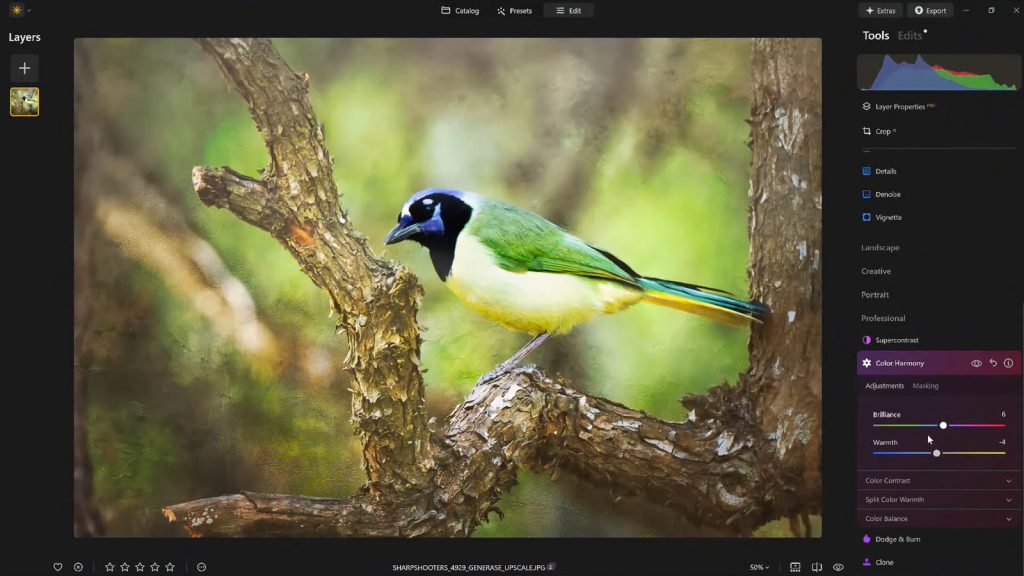
- Core Functionality: Provides granular control over color interactions, balancing tone, contrast, and warmth without resorting to blunt-instrument saturation sliders.
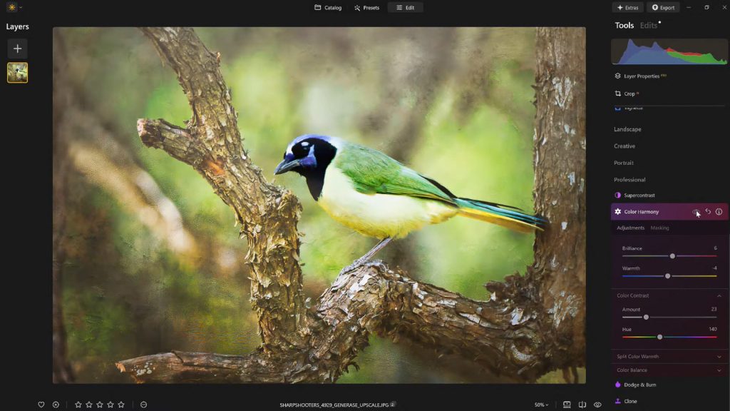
- Key Sub-Controls: Brilliance, Warmth, Color Contrast, Split Warmth, and Color Balance.
- Ecosystem Integration: Works seamlessly alongside targeted vignetting and custom preset creation to streamline professional editing workflows.
Industry data suggests that post-processing bottlenecks cost independent photographers hours of billable time per week. Tools that offer precise global and localized adjustments without the need for complex multi-layer masking significantly reduce editing times, allowing creators to focus on artistic vision rather than technical remediation.
A Chronological Evolution of Digital Color Control
To understand the significance of features like Color Harmony, one must look at how digital editing has evolved over the past twenty years.
Phase One: The Global Slider Era (Early 2000s)
In the early days of digital photography software, adjustments were largely global. Photographers relied heavily on master saturation and vibrance sliders. Cranking up saturation often resulted in clipped channels, unnatural skin tones, and digital artifacts. Images frequently looked "cooked" or heavily overprocessed.

Phase Two: The Rise of Local Adjustments (2010s)
As sensors improved and processing power increased, software developers introduced localized adjustments—brushes, radial filters, and graduated filters. While this allowed for immense precision, it also introduced complexity. Photographers could spend hours meticulously painting masks to balance the color temperature between a cool shadow and a warm highlight.
Phase Three: AI-Assisted Nuance and Integrated Harmony (Present Day)
Today, platforms like Luminar Neo represent the current evolution: marrying computational intelligence with intuitive color-theory frameworks. Color Harmony reflects this modern ethos. Rather than forcing photographers to manually isolate channels or build complex tone curves, the tool leverages algorithmic intelligence to apply professional color-grading principles—such as complementary and analogic color relationships—through simple, slider-based interfaces.
Deconstructing the Toolkit: Supporting Data and Mechanics
To master Color Harmony, a photographer must understand what each sub-tool contributes to the final image matrix. Skylum’s design philosophy for these features emphasizes restraint over radical transformation.
1. Brilliance and Warmth: The Gentle Touch
- Brilliance: Unlike standard saturation, which amplifies all colors uniformly (often blowing out already-vibrant hues), Brilliance targets under-saturated tones intelligently. A slight positive adjustment enriches colors while preserving critical natural textures and luminance values. Conversely, pushing it too far introduces an artificial, plastic sheen.
- Warmth: This slider moves beyond a basic white balance adjustment. Shifting right introduces a golden, cinematic glow, while shifting left cools the atmosphere. The guiding rule of thumb is emotional alignment: the warmth must match the ambient lighting conditions present during capture.
2. Color Contrast and Split Warmth
- Color Contrast: This feature amplifies the visual tension between opposing color ranges—most notably the interplay between warm highlights and cool shadows. When applied judiciously, it generates a profound sense of three-dimensional depth, making subjects pop naturally from their backgrounds.
- Split Warmth: Offering surgical precision over complex lighting scenarios, Split Warmth allows creators to separate and manipulate warm and cool tones independently across different tonal ranges. While not every image requires this level of intervention, layered landscape compositions and complex environmental portraits benefit immensely from the color separation it provides.
3. Color Balance: The Pro-Level Grade
Perhaps the most powerful feature in the suite, Color Balance grants independent control over the color hues residing in shadows, midtones, and highlights.

- Shifting midtones slightly toward warmer or cooler vectors can instantly transform a cold, uninviting landscape into an evocative scene, or neutralize unwanted color casts in portraiture.
- Mastering this tool allows photographers to establish a signature, cinematic color grade that remains entirely consistent across an entire portfolio or client delivery set.
4. Guiding the Eye with Advanced Vignetting
Once the color palette is locked, composition requires final reinforcement. Luminar Neo approaches vignetting not merely as a dark border effect, but as a luminosity tool. By darkening edges while simultaneously introducing an Inner Light adjustment to the center of the frame, the software creates a virtual spotlight. This naturally draws the viewer’s gaze toward the primary subject without the administrative overhead of complex masking.
Industry Perspectives and Official Insights
Vanelli, an accomplished photographer, author, and Skylum’s Director of Education, emphasizes that the hallmark of professional editing is restraint. Transitioning from a background as a Triple Crown Karate champion to a prominent voice in the visual arts, Vanelli has trained thousands of photographers globally through workshops, educational videos, and the popular Luminar Coffee Break series.
"What sets apart a truly compelling image often isn’t a dramatic, jaw-dropping change—it’s a handful of carefully considered enhancements," Vanelli notes. "Photographers frequently fall into the trap of over-editing because they lose perspective during a long session. Tools like Color Harmony give you the power to add emotion, depth, and cohesion without destroying the natural integrity of the capture."
Industry analysts point out that as consumer-facing AI cameras continue to improve raw image quality straight out of the box, the role of desktop editing software is shifting. Software can no longer just "fix exposure"; it must offer distinct artistic signatures and streamlined workflow efficiencies that justify subscription or purchase costs. Features that bridge the gap between complex color theory and one-click execution are precisely what modern content creators and professional photographers demand.
Workflow Implications: The Power of Presets and Stepping Back
For working professionals handling high-volume shoots—such as wedding photographers, real estate specialists, and commercial creators—efficiency is directly tied to profitability.
Luminar Neo addresses this through a robust preset workflow. Once a photographer uses Color Harmony, tone controls, and vignettes to dial in a signature look for a hero image, saving those parameters as a custom preset establishes an immediate baseline for the rest of the series.
Furthermore, this workflow safeguards against a common psychological pitfall in post-processing: eye fatigue.
- The Problem: After staring at a high-contrast image for twenty minutes, a photographer’s eyes adjust, making heavy-handed edits and over-saturation look normal.
- The Solution: By stepping away from the screen, returning later, and applying a saved preset at a reduced opacity (e.g., 70% to 80%), creators can retain the core aesthetic improvements while pulling back on excessive processing.
Conclusion: Balancing Control and Creativity
The evolution of digital post-processing software continues to lower the technical barriers to entry while raising the ceiling for artistic expression. Programs like Luminar Neo demonstrate that powerful editing does not require an intimidating array of confusing layers and destructive masking techniques.
By centralizing nuanced color control into intuitive features like Color Harmony, photographers are empowered to rescue dull captures, establish cohesive stylistic branding, and inject genuine emotion into their work.
For creators looking to experiment with these professional finishing tools, Skylum currently offers a 10% discount on Luminar Neo using the exclusive promo code NATURETTL at checkout.
