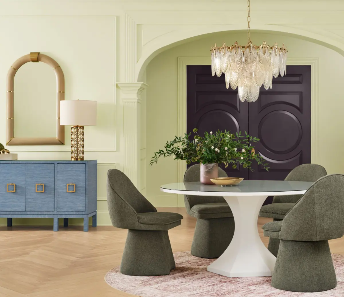
For decades, the standard initiation rite into homeownership and interior decoration has been an overwhelming, agonizing stare down a hardware store aisle packed with white, cream, and beige paint swatches. Paint is universally heralded by designers as the most accessible, lowest-commitment vehicle for injecting personality into a residential space—far less daunting than ripping out tile or reupholstering custom furniture. Yet, fear of the unknown and the paralysis of choice have historically driven millions of homeowners right back to safe, predictable neutrals.
Now, major paint and coatings titan Sherwin-Williams—alongside its sister brand HGTV Home by Sherwin-Williams—is challenging that cautious instinct. Recognizing that genuine design reward often requires taking a calculated risk, the company has officially unveiled its 2027 Color of the Year: Celery.
Described as a light green with a subtle yet distinct yellow undertone, Celery is poppy, refreshing, and balances a soft, calming presence with an unexpected jolt of energy. Crucially, the shade represents a sharp stylistic departure from the heavy, moody, or earthy greens that have dominated residential design trends over the past decade.
Main Facts: The 2027 Color Selection and Comprehensive Forecast
The unveiling of Celery anchors Sherwin-Williams’ exhaustive Colormix 2027 Trend Forecast, a kaleidoscopic collection comprising 48 distinct shades designed to guide architects, interior designers, and DIY enthusiasts through the next wave of spatial storytelling.
The Hero Shade: Celery is a light, herbaceous green featuring delicate yellow undertones. It offers high usability without the overpowering intensity of neon or lime greens.
The Broader Collection: The 48-hue forecast spans a massive emotional spectrum. It features vibrant pop colors like Grenadine (a bright pink) and Forward Fuchsia, grounding traditional darks like Midnight (a deep plum) and Salty Dog (a classic navy), alongside cheerful, nostalgic accents such as Real Red, Trinket (a warm mustard yellow), and Dutch Tile Blue.
Strategic Guardrails: The collection intentionally includes 10 continuity colors, serving as foundational neutrals that allow designers and homeowners to experiment with bold hues without losing spatial cohesion.
Expert Backing: The selection was spearheaded by Sue Wadden, Sherwin-Williams’ director of color marketing, and Emily Kantz, interior designer and color strategist.
Chronology: How the Green Trend Evolved Into Celery
To understand why Celery feels so revolutionary for 2027, it helps to trace the historical timeline of green in contemporary interior architecture over the last fifteen years.
The Rise of Earthy and Botanical Greens (2010s–Early 2020s)
Following the post-recession era’s obsession with gray, green slowly crept back into mainstream design around the mid-2010s, initially manifesting as botanical accents, indoor plant pairings, and sage-painted cabinetry. By the early 2020s, green had firmly established itself as the defining chromatic overarching theme of the decade. However, these iterations heavily favored richness, weight, and depth—think dark forest greens, muddy olives, and saturated pine shades designed to evoke a sense of grounding, sanctuary, and biophilic connection during periods of global uncertainty.
The Shift Toward Comfort and Connection (Mid-2020s)
As the world stabilized, subsequent color forecasts from major manufacturers pivoted toward themes of holistic wellness, soft comfort, and subtle balance. Paint companies relied heavily on muted, dusty pastels and warm, organic neutrals, reflecting a collective desire for tranquility and low-stress living environments.
The 2027 Pivot: Playfulness and "Visual Exhale" (Present)
In developing the palette for 2027, Sherwin-Williams trend forecasters noticed a psychological shift among consumers. Rather than retreating into cozy, cocoon-like sanctuaries, homeowners are looking to express individuality, joy, and confidence. Celery emerged from this zeitgeist. Moving away from the heavy, dark greens of the early 2020s, Celery functions as a "visual exhale"—a lighter, airier option that invites playfulness, challenges traditional design rules, and encourages less perfectionism in home decor.
Supporting Data and Spatial Strategies
Implementing a bright, yellow-undertoned green like Celery requires a nuanced understanding of light, scale, and architectural context. Sherwin-Williams color experts have outlined several empirical strategies for deploying both the hero shade and its companion colors within the Colormix 2027 portfolio.
Harnessing Natural Light with Celery
According to Sue Wadden, Celery’s yellow undertone makes it exceptionally responsive to natural light conditions. It performs with remarkable vibrancy in north-facing rooms, which typically receive cooler, bluer natural light throughout the day; the yellow undertones counteract that chill, warming up the space without sacrificing the freshness of green.
Color-Drenching: For bold designers, painting an entire room—walls, trim, and ceiling—in Celery creates a cohesive, immersive environment.
Targeted Accents: For those hesitant to commit to an entire room, Celery serves as an ideal accent for high-impact micro-spaces. Wadden notes that painting a kitchen island, a living room console, or custom built-in shelving unit in Celery yields an outsized visual return against stark white or neutral walls.
Managing Richness and Contrast
Traditional rooms and classic architectures are timeless, but they can easily slip into monotony without thoughtful contrast. The 2027 forecast incorporates deep, grounding tones like Midnight (plum) and Salty Dog (navy) to anchor historical or traditional spaces.
Emily Kantz recommends a "stepped" approach for homeowners accustomed to safe neutrals:
Phase One: Introduce a rich shade exclusively as an accent on an architectural element, such as a painted bookshelf or kitchen island.
Phase Two: Build confidence over time, eventually progressing to more daring applications, such as completely color-drenching a formal dining room in a complex neutral like Roycroft Bronze Green.
Embracing Intentional Tension
One of the most defining data points of the Colormix 2027 collection is its emphasis on unexpected color collisions. Rather than matching monochromatic palettes, current consumer behavior favors layered, curated spaces that reflect complex personal identities. Kantz highlights pairings such as the soft pink Lotus Petal set against the vibrant green Jadite, or pairing Celery with a bold, saturated red. These high-tension combinations inject vitality and human narrative into domestic architecture.
Official Responses and Industry Insights
The rollout of Celery and the Colormix 2027 forecast has sparked widespread commentary across the interior design and architectural communities. Industry leaders emphasize that the selection is less about dictating a passing fad and more about empowering consumers to reclaim agency over their living environments.
"This is a different interpretation that’s softer and more usable," explains Sue Wadden, Director of Color Marketing at Sherwin-Williams. "It’s herbaceous, but not super bright. I think people are going to be excited by the challenge of how to use it." Wadden notes that while green has reigned supreme for ten years, Celery subverts expectations by offering lightness where consumers have grown accustomed to heavy saturation.
Interior designer Corey Damen Jenkins, weighing in on the structural utility of the shade, praises its flexibility as a foundational element.
"As a foundation, it offers real versatility," Jenkins states. "It can anchor a palette without overpowering it."
Meanwhile, Emily Kantz, interior designer and color strategist for the brand, emphasizes the underlying psychological shift driving the 2027 forecast.
"While previous forecasts explored ideas of comfort, balance, and connection, this year’s forecast embraces greater confidence through color, texture, and unexpected combinations," Kantz says. "We’re seeing people create spaces that tell a story about who they are and how they want to live. Color influences mood, shapes our experiences, and helps create meaningful connections to the places we spend the most time. Colormix 2027 is an invitation to embrace that potential and to design with intention, creativity, and confidence."
Kantz stresses that the ultimate goal of the initiative is to dismantle the anxiety surrounding paint selection. "We want to give people the confidence to see color as an opportunity rather than a design risk," she adds.
Implications for the Future of Home Design
The selection of Celery as the defining hue for 2027 carries several profound implications for the broader housing, renovation, and interior design markets:
1. The Death of Total Minimalism
For over a decade, minimalist interiors defined by sterile whites, monochromatic grays, and clinical austerity have faced a gradual pushback. Celery—alongside the bold pinks, mustards, and plums in the Colormix forecast—signals the acceleration of "maximalist expressionism." Consumers are rejecting cookie-cutter, catalog-perfection aesthetics in favor of quirky, deeply personal spaces that embrace imperfection, nostalgia, and emotional resonance.
2. A Shift in DIY Renovation Confidence
Paint remains the single most cost-effective tool in home improvement. By offering a comprehensive system of 48 colors anchored by 10 continuity neutrals, Sherwin-Williams is providing amateur renovators with a safety net. This structure lowers the psychological barrier to entry for bold design choices, likely driving an uptick in experimental DIY projects—such as two-tone kitchen cabinetry, color-drenched powder rooms, and contrasting trim work—among younger homeowners.
3. Sustainability and Biophilic Design Evolution
While biophilic design previously manifested as dark, forest-inspired tones meant to mimic dense woodlands, Celery represents a lighter, agricultural, and spring-like awakening. This evolution aligns with a broader cultural focus on renewal, vitality, and sustainable living spaces that feel alive, breathable, and energetically light.
Conclusion
As homeowners look toward 2027, the era of retreating into passive, risk-averse neutrals is officially taking a back seat. Backed by expert forecasts and a versatile spectrum of complementary shades, Sherwin-Williams’ Celery invites individuals to step out of their comfort zones. Whether deployed as a subtle nod on a piece of millwork or used to entirely drench a room in herbaceous light, this cheerful green proves that stepping away from the beige swatch wall can lead to the most rewarding transformation of all: a home that proudly and vividly tells its owner’s unique story.